The Situation
Oh boy.
Well, there was certainly room for improvement. But you can't fix something if you don't understand how it got like this in the first place. Time to dive into research.

 Personas Documentation
 Rapid iteration with designers
 CMS Customization
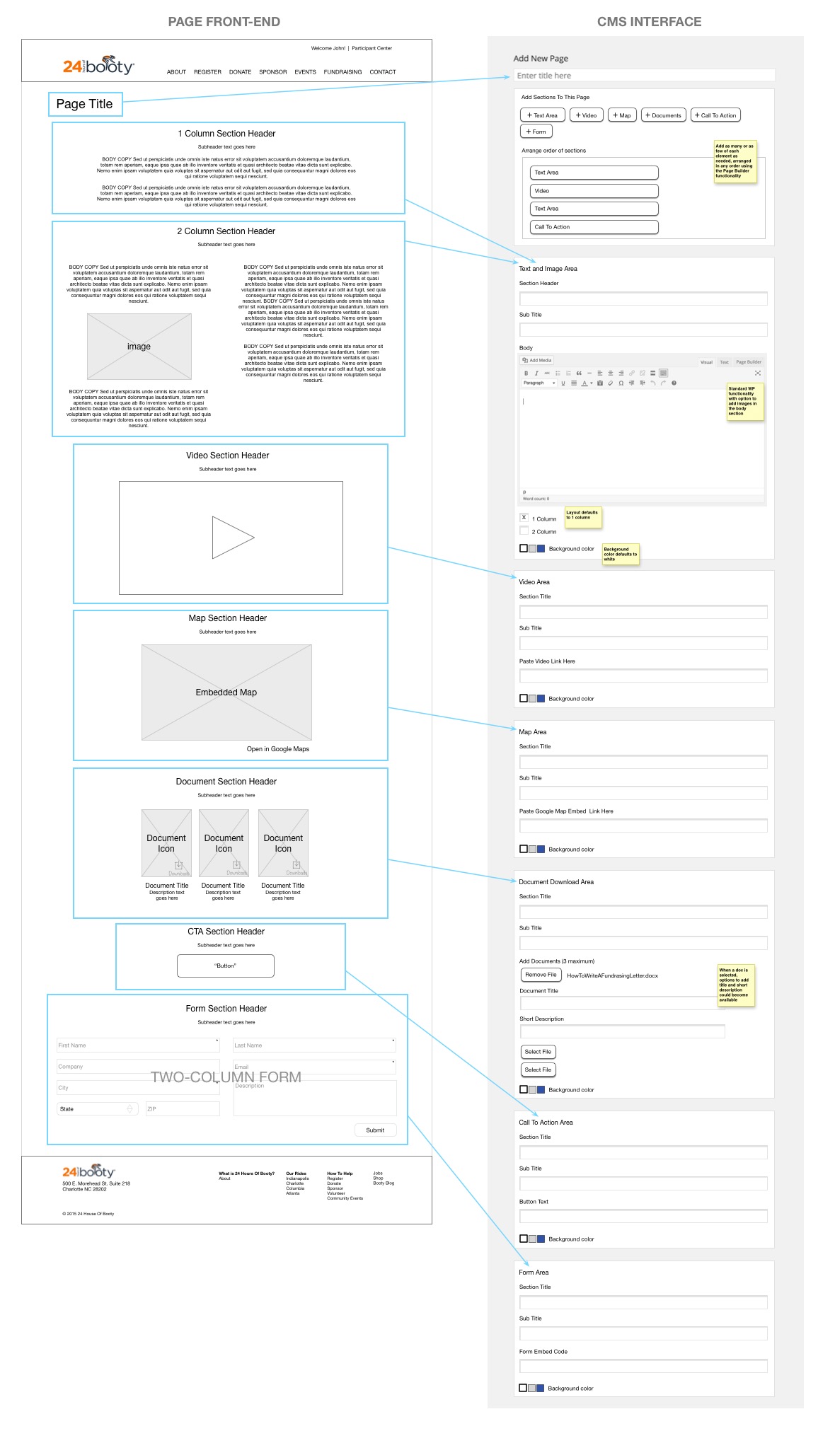
 CMS Customization Design
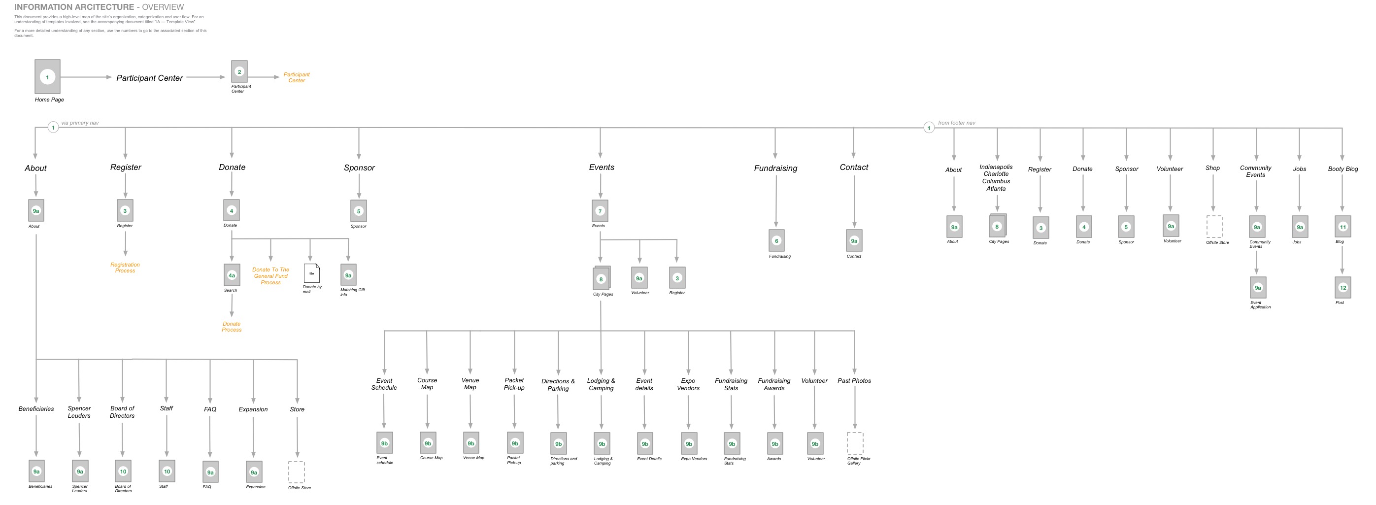 Architecture Overview
 Template Inventory
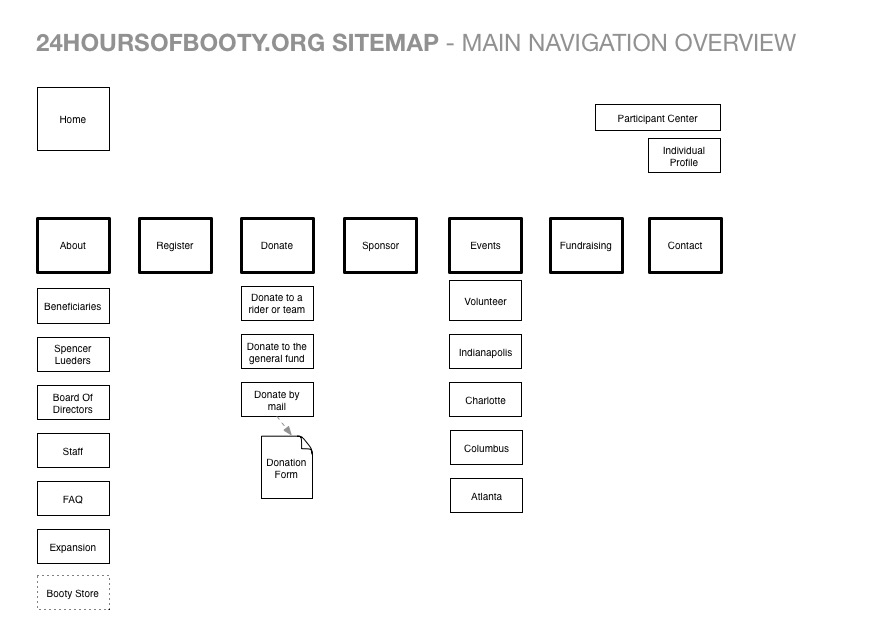 Simple Site Map
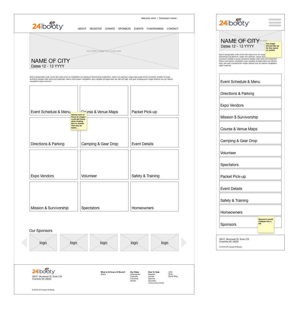 Events Section Wireframes
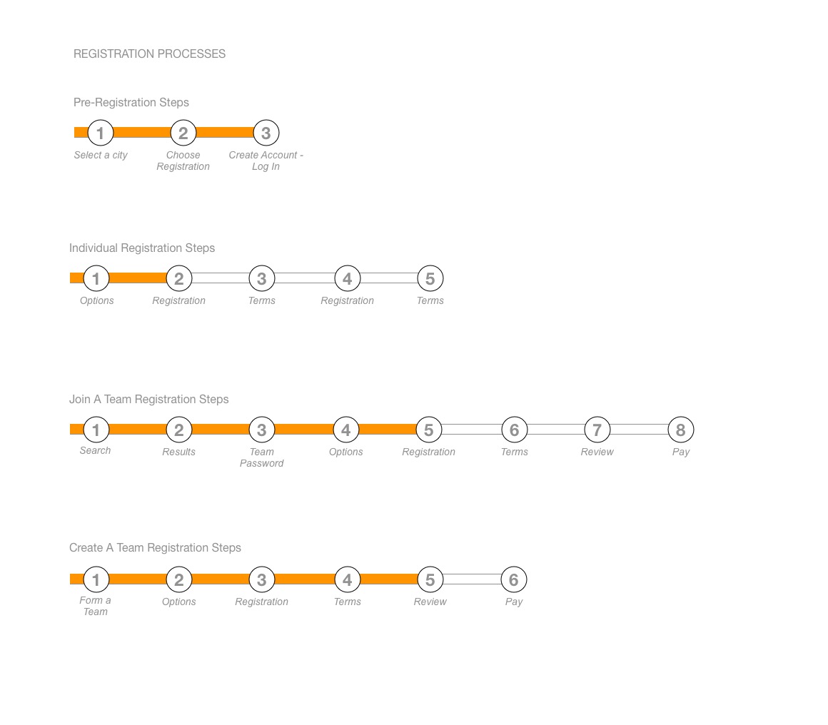 Process Documentation
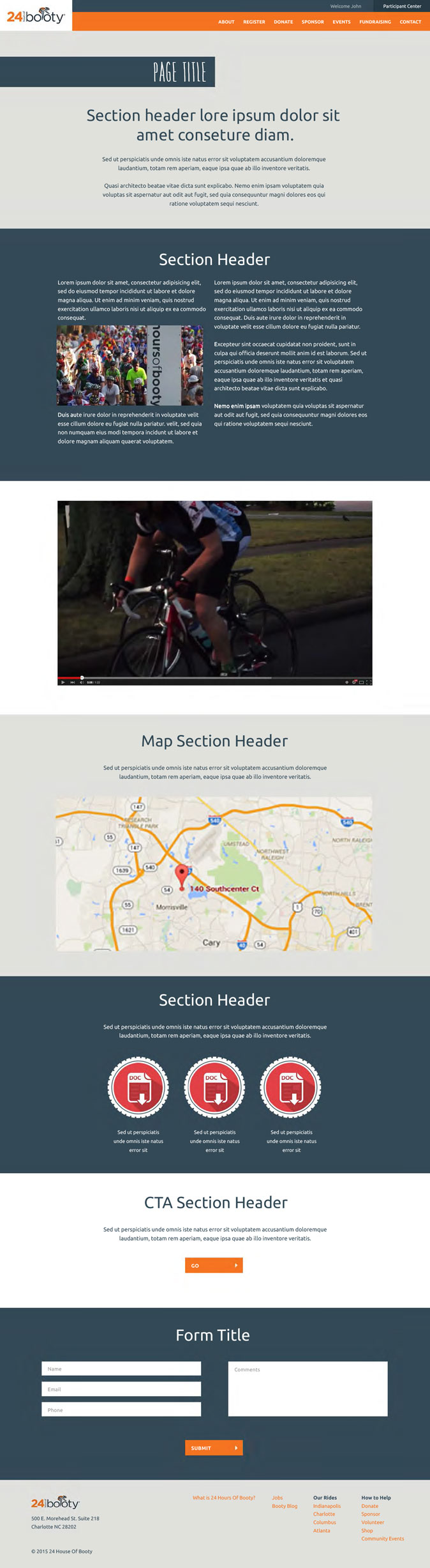
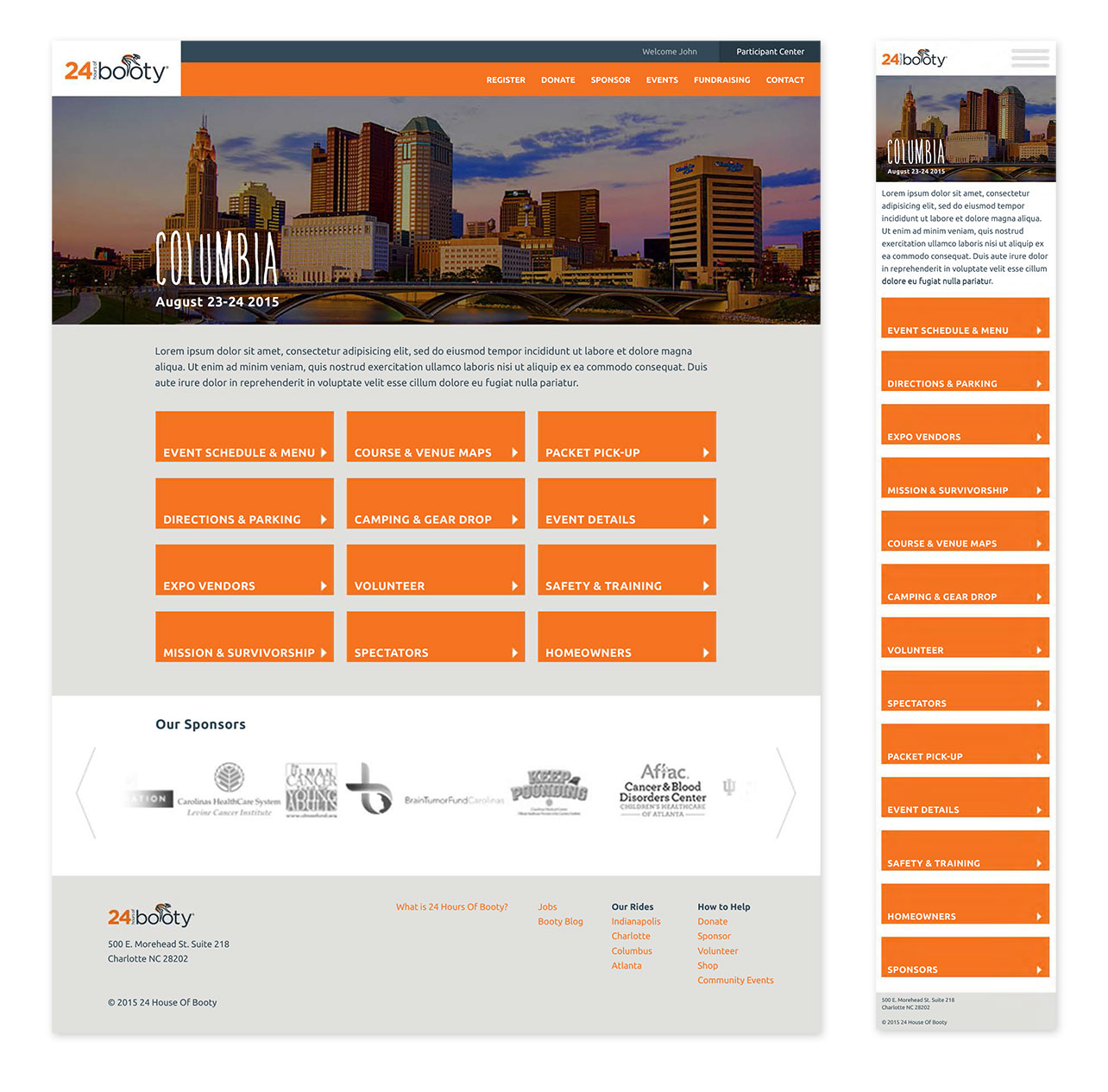 Events Section Designs
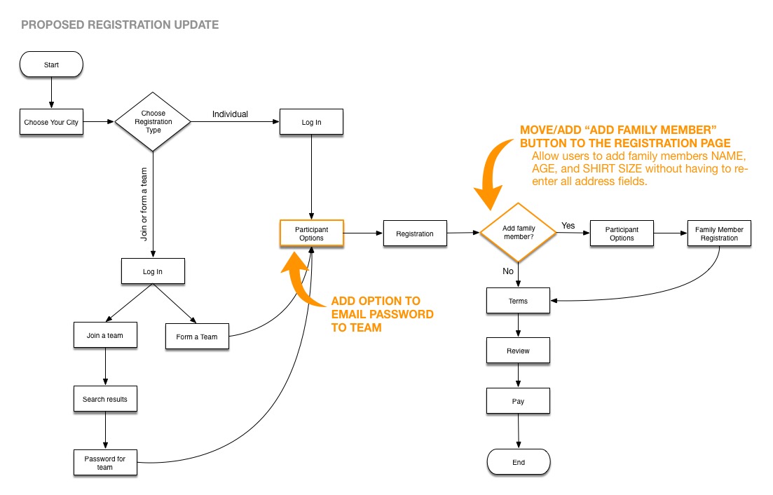 Process Updates
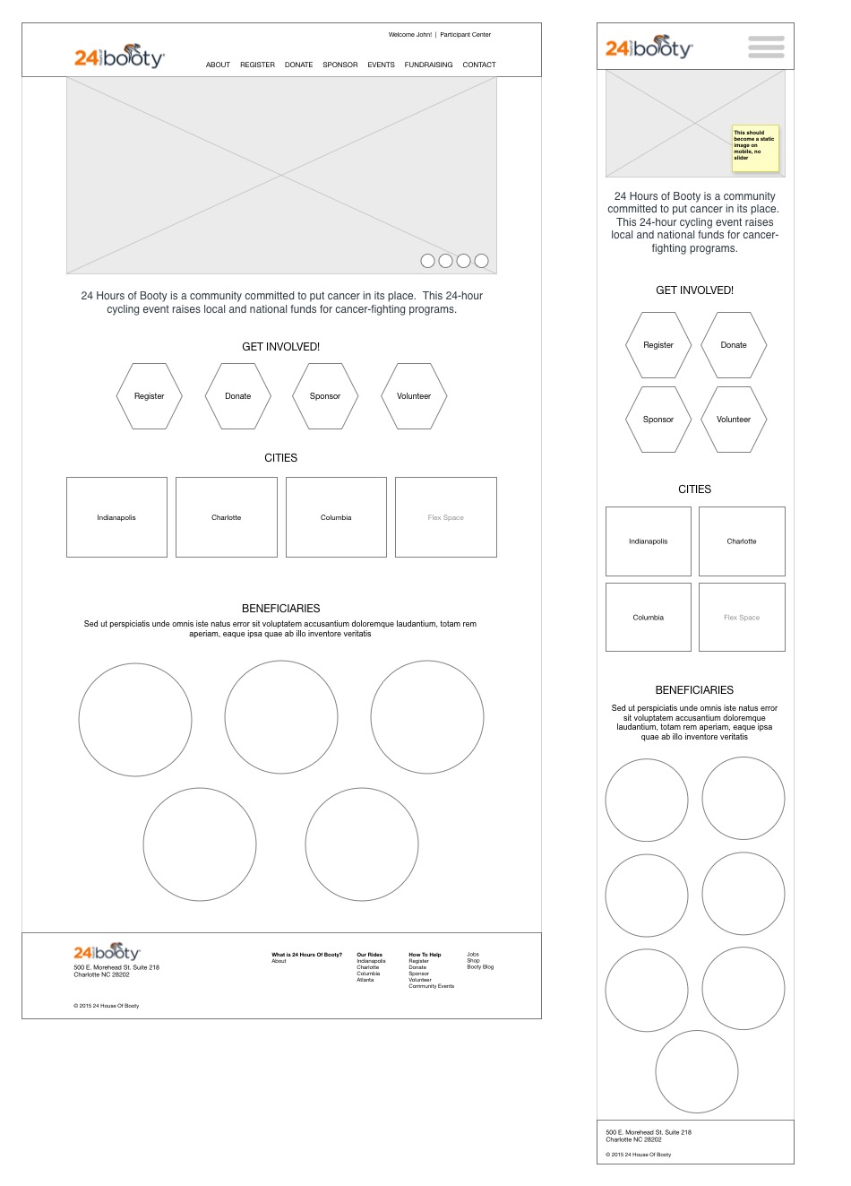 Homepage Wireframes
 Homepage Designed
 Donate Wireframes
 Donate Designed
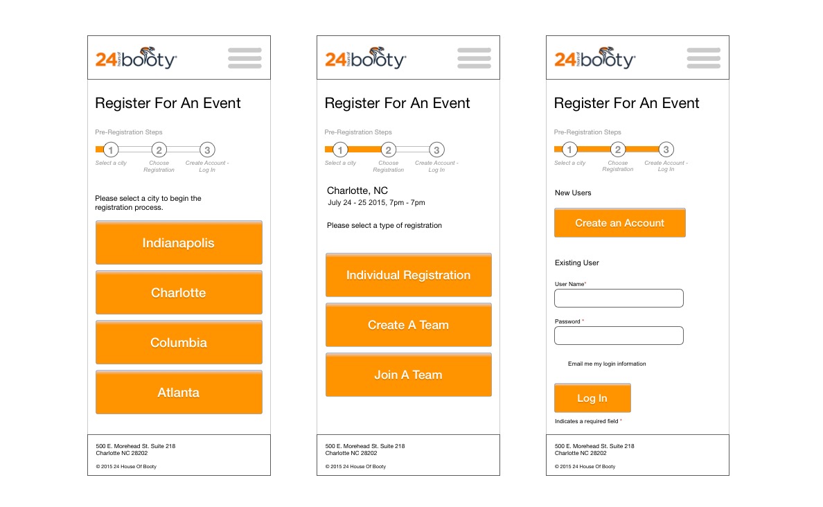 Process Wireframes - Mobile
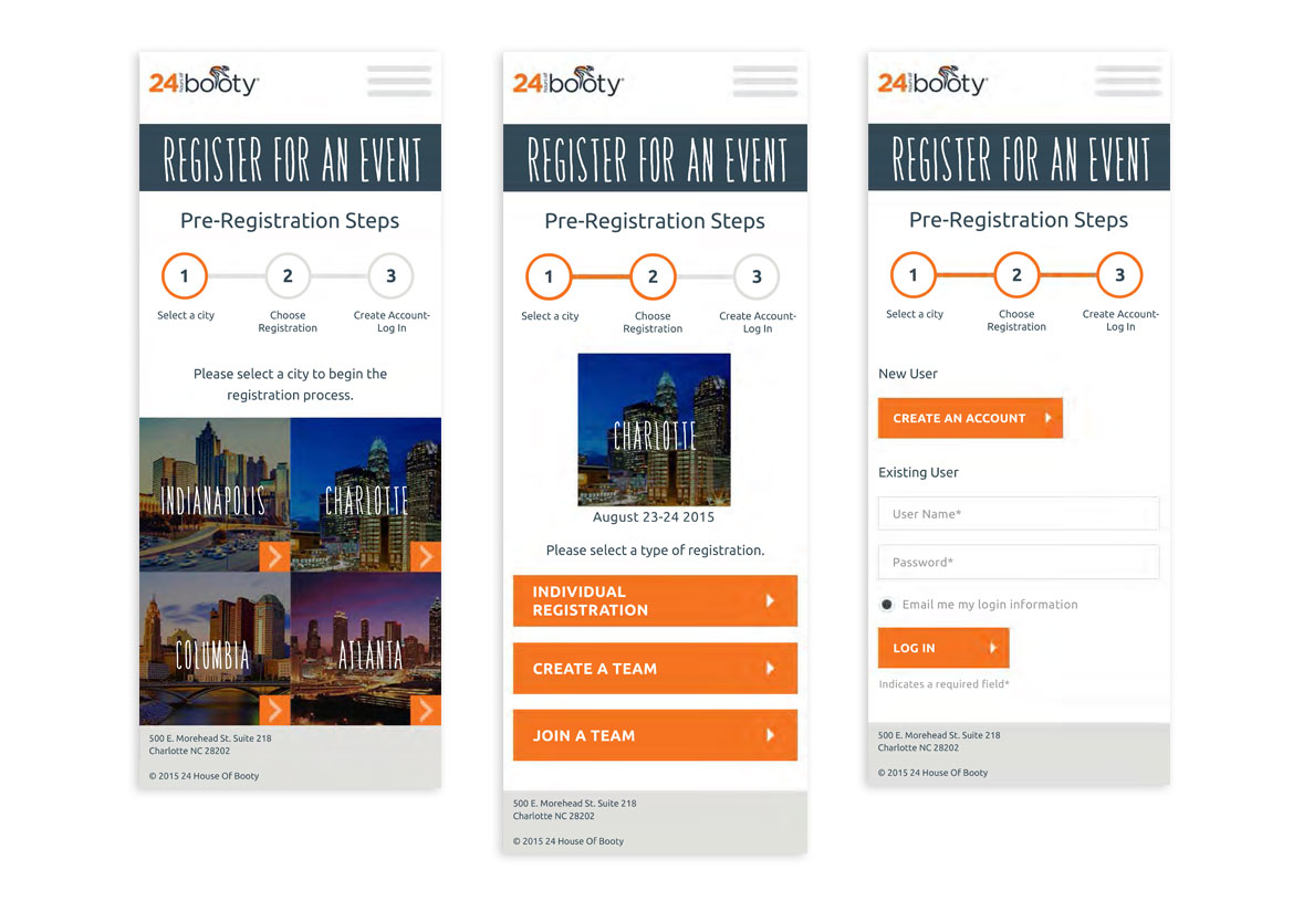 Process Designs - Mobile
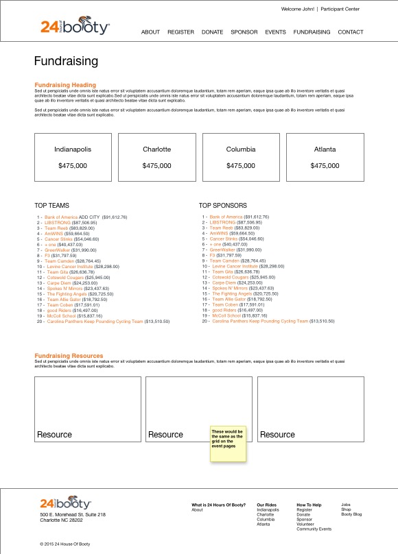 Fundraising Wireframes
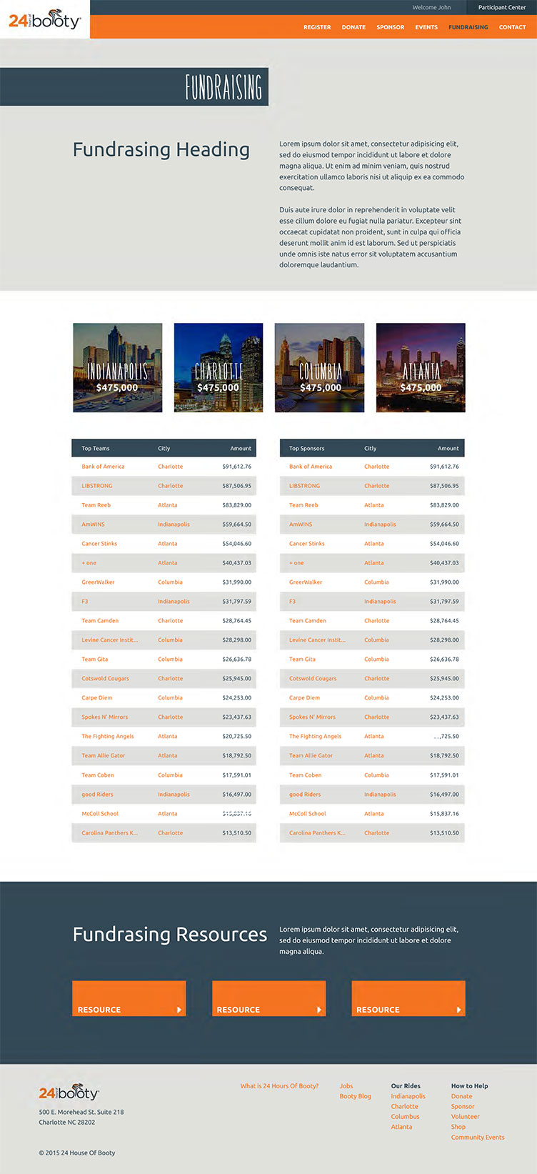 Fundraising Design
 Participant Center