“People get frustrated when registering, and also when trying to use the site at the events”
Every year, in multiple cities in the US, 24 Hours Of Booty (now 24 Foundation) raises millions to support cancer survivorship programs. But the site had become overgrown with content, and therefore frustrating to use. I was asked to fully redesign the entire experience.
My Role
For this project, I owned strategic direction throughout. I redesigned the site architecture from the ground up based on the needs of their 5 user groups, and I got to work with an excellent graphic design and development team. And the client was awesome too.
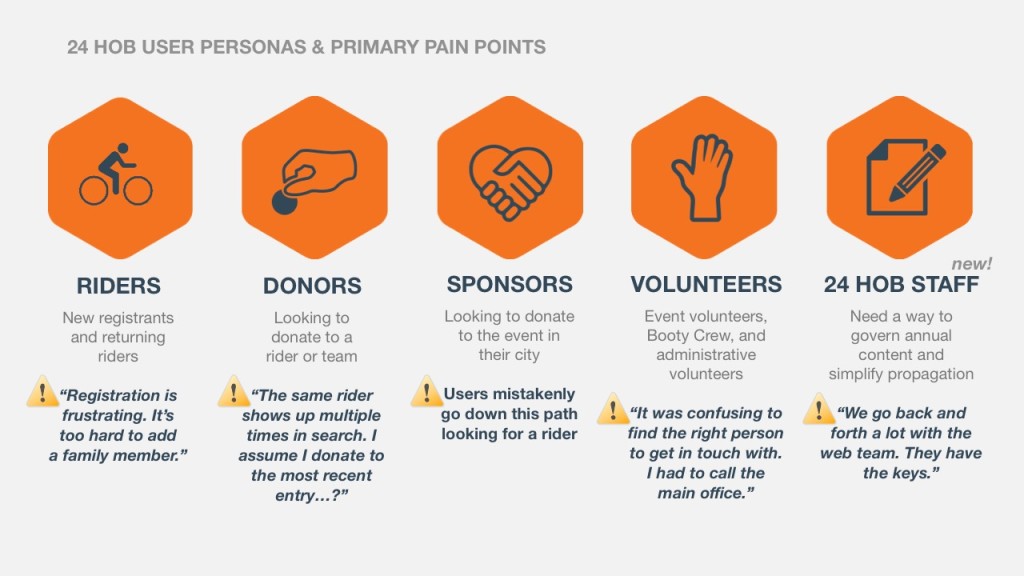
It all started with user research. After lots of interviews, I delivered the most important guiding document of the entire process: the personas.
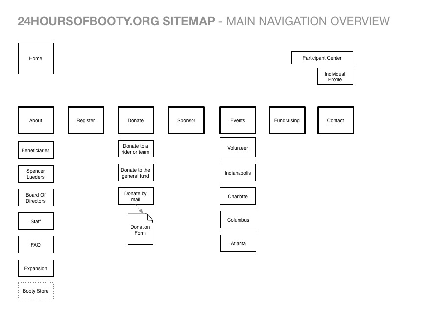
Front-end architecture
With our 5 user groups in mind I began redesigning the architecture of the site. This included a restructure of the primary navigation to surface site elements that were crucial to certain users (for example, elevating “Donate” to the primary nav).
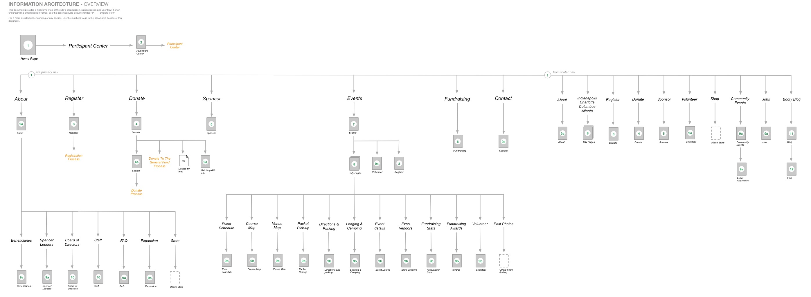
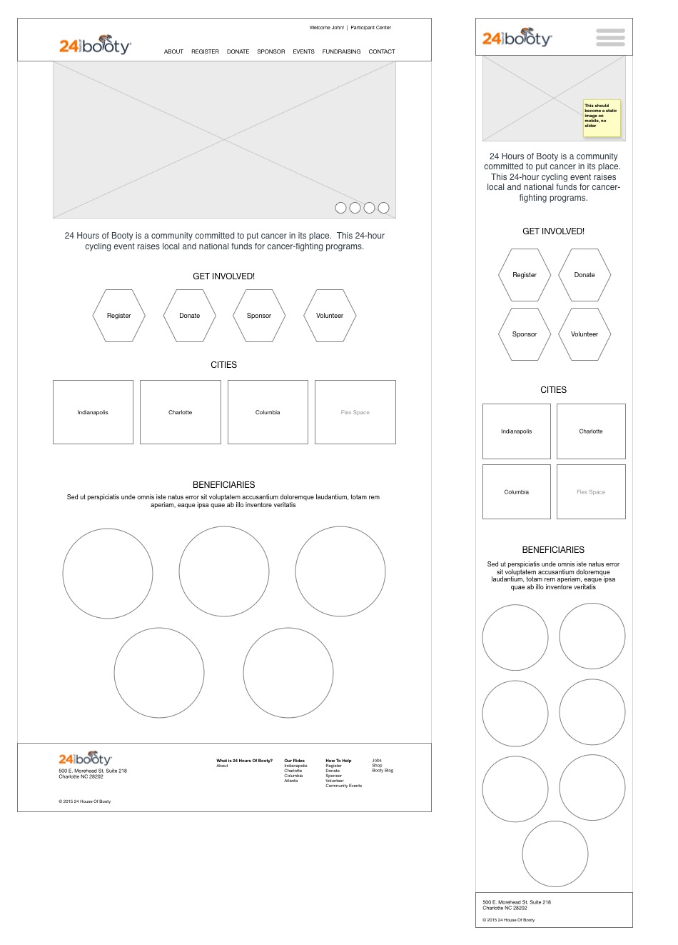
Elevating primary paths in the UI while reducing cognitive load
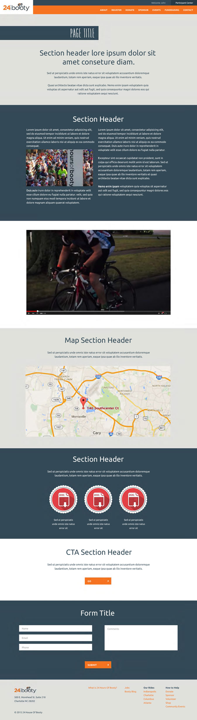
The new UI elevated the most important user paths, and incorporated a design language that would be used throughout the site.
People came to the site to register, donate, sponsor, volunteer, or get info about their city’s event. Those paths were now front and center.

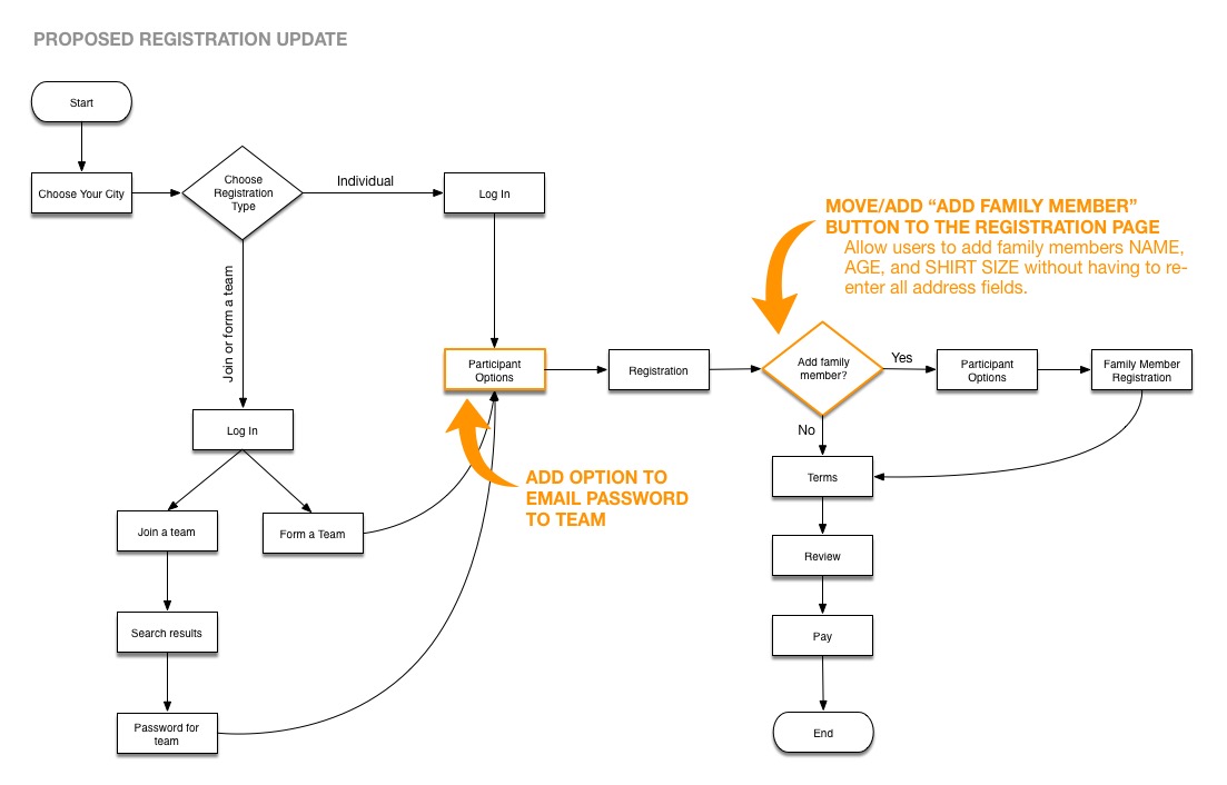
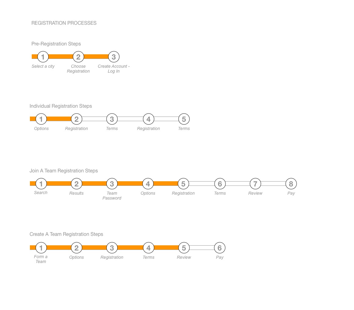
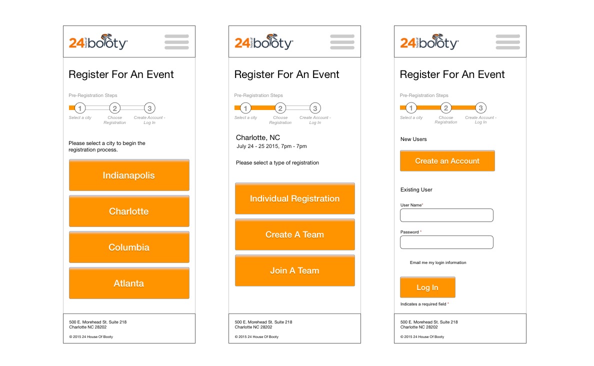
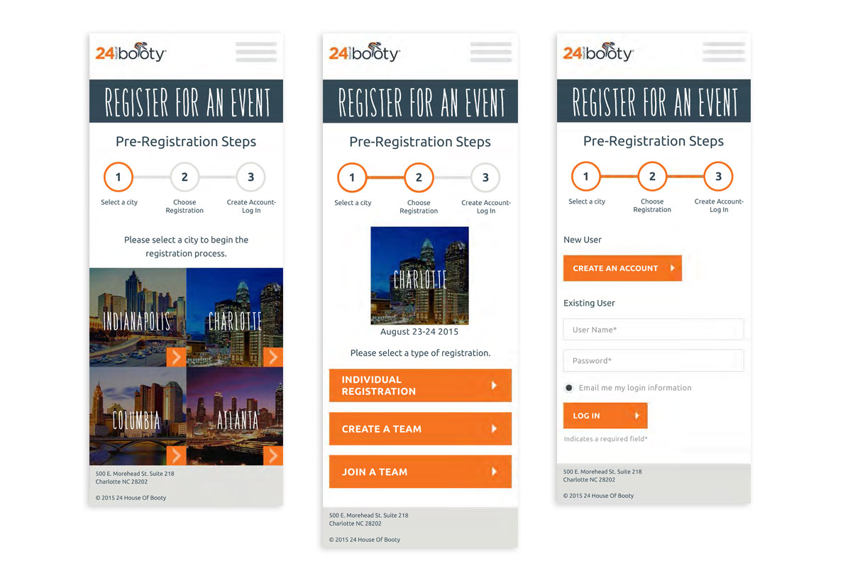
For Riders – Reducing friction in the registration process
Adding a family member during registration required you to re-enter all of the address info you had already entered for yourself. Documenting the user flow for the development team made it clear which step needed to be adjusted.
Also, different types of registrations required entirely different sets of steps, leading users to wonder “how many more screens do I have to go through?!” Implementing one of Jacob Neilsen’s 10 usability heuristics know as “system status” helped clear this up. Now, users could clearly see how much farther they had to go.
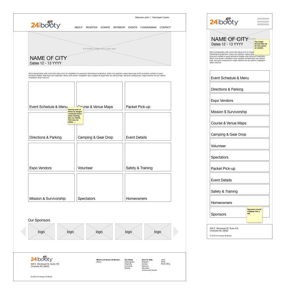
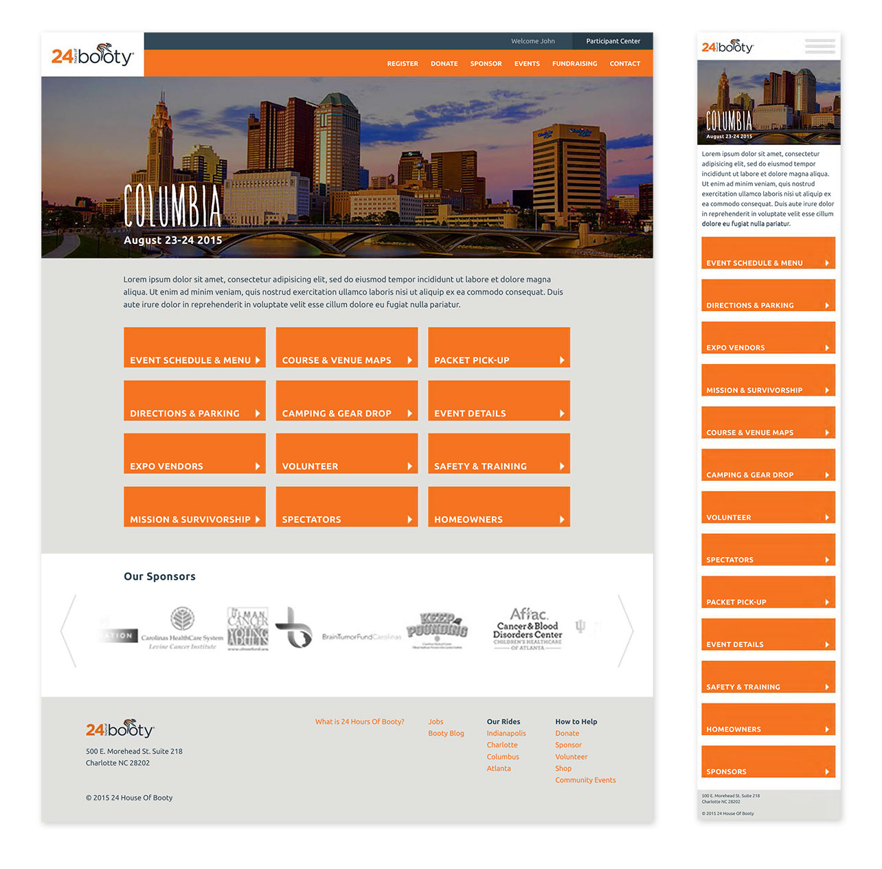
Making the event pages easy for day-of use
One of the most frustrating parts of the old experience occurred on the day of the races when people were looking for much needed information as they arrived at the events. Content about where to park, where to check in, etc, was buried.
The new content architecture was designed specifically to make this information easy to find on mobile devices.
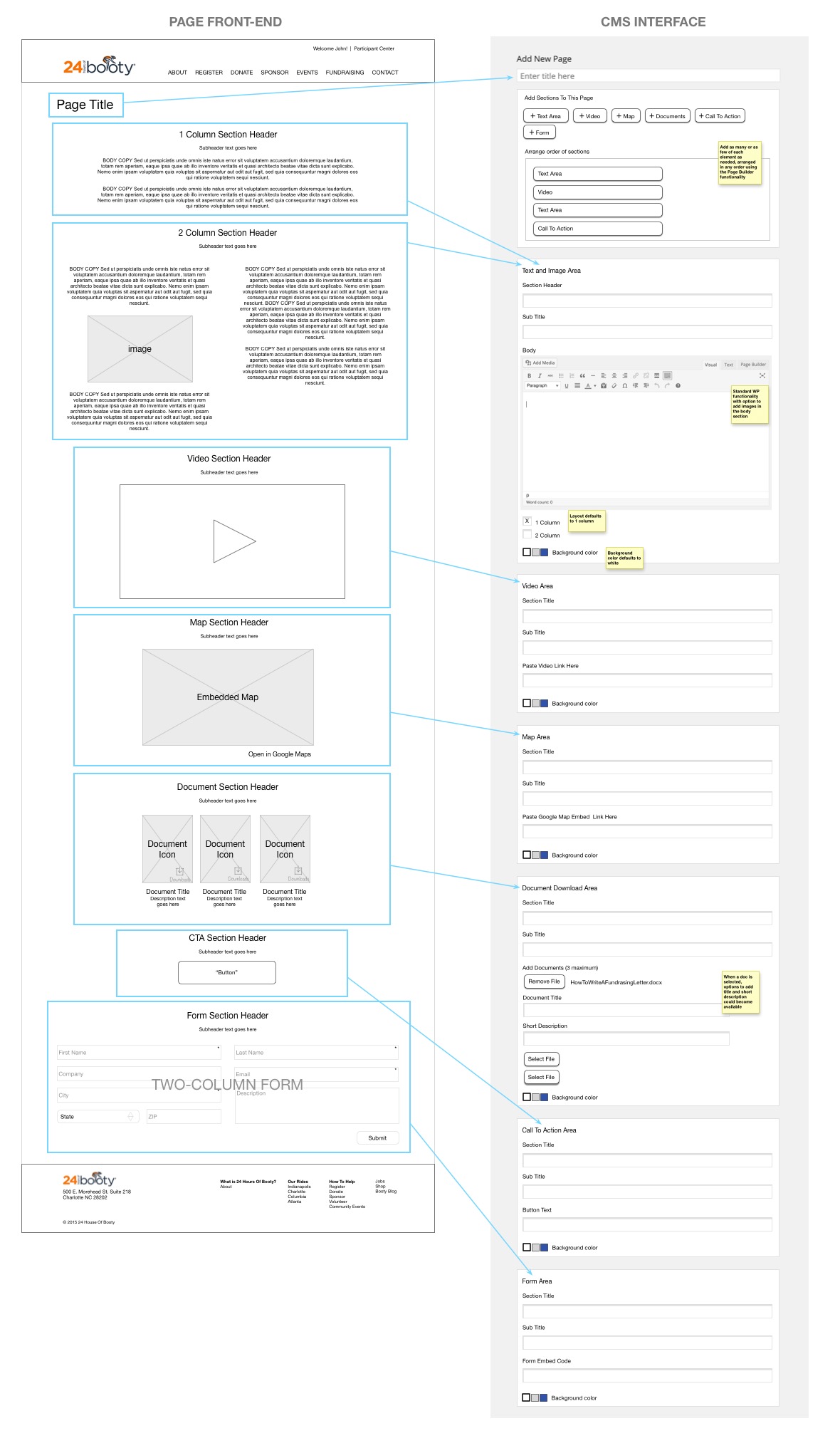
For The Internal Team – Customizing the WordPress interface so they no longer had to rely on web developers to update content
Every time the internal teams in each city wanted to make a change to their city’s content they had to forward their requests to their external web development agency. This incurred a cost each time, and the expenses added up.
I designed an intuitive WordPress interface for the team to use when updating the city pages, and trained the team to use it.
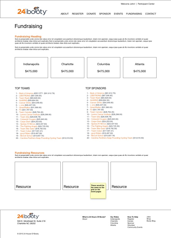
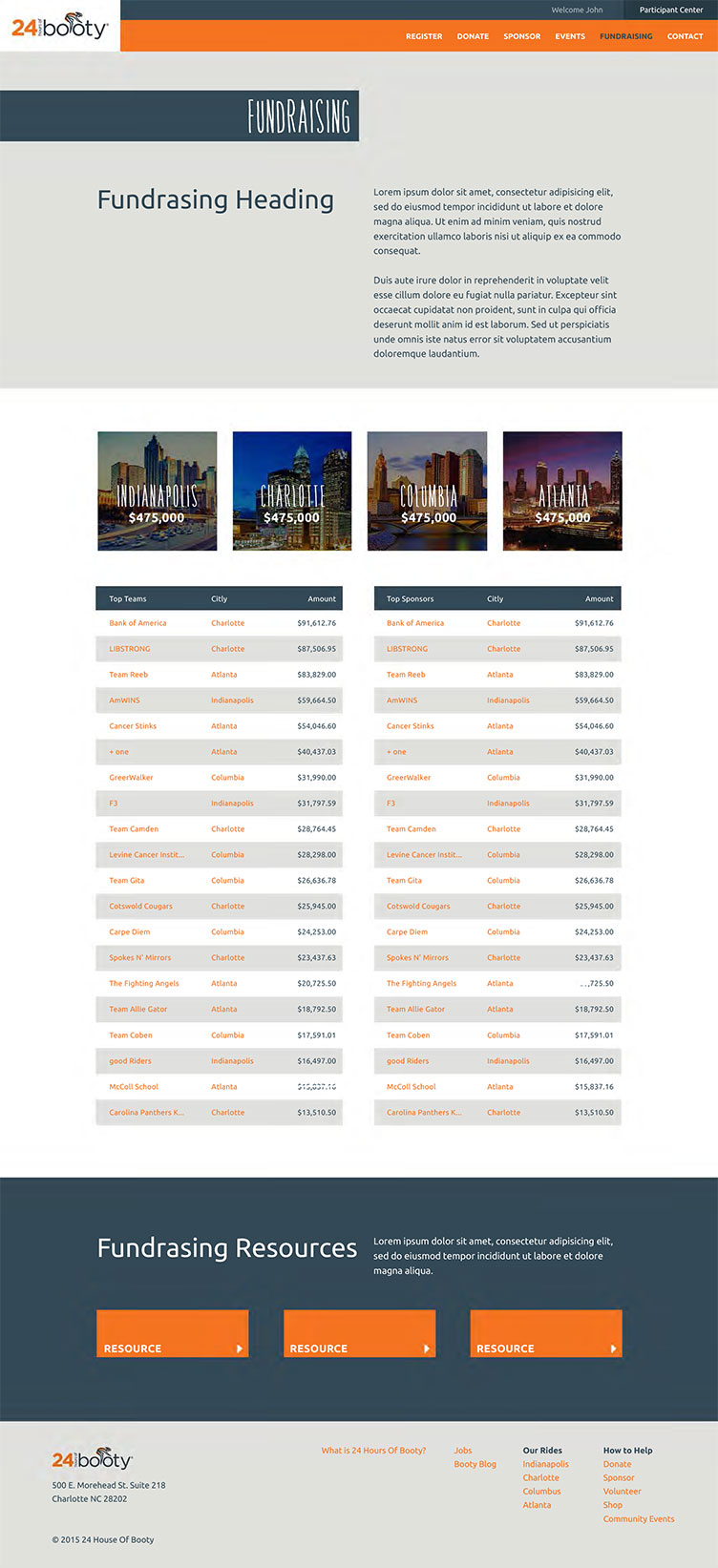
Encouraging donation by creating UI’s that foster competition
Thanks for your $50,000 in donations BB&T, but now you can see that Bank of America donated $100,000, so….